Google approached us wanting a new experience that educates users on what Android is, and encourages users to buy into the Android ecosystem. People buy products not platforms. The challenge with this project was to find the best way to educate users who are unfamiliar with Android as a platform.
Android has an ongoing client relationship with Huge that was forged after the initial redesign of the site. After the site overhaul, we partnered with our clients to redesign a few key Android experiences including: Android Pay, Android Solutions Directory, and the Android P landing page.
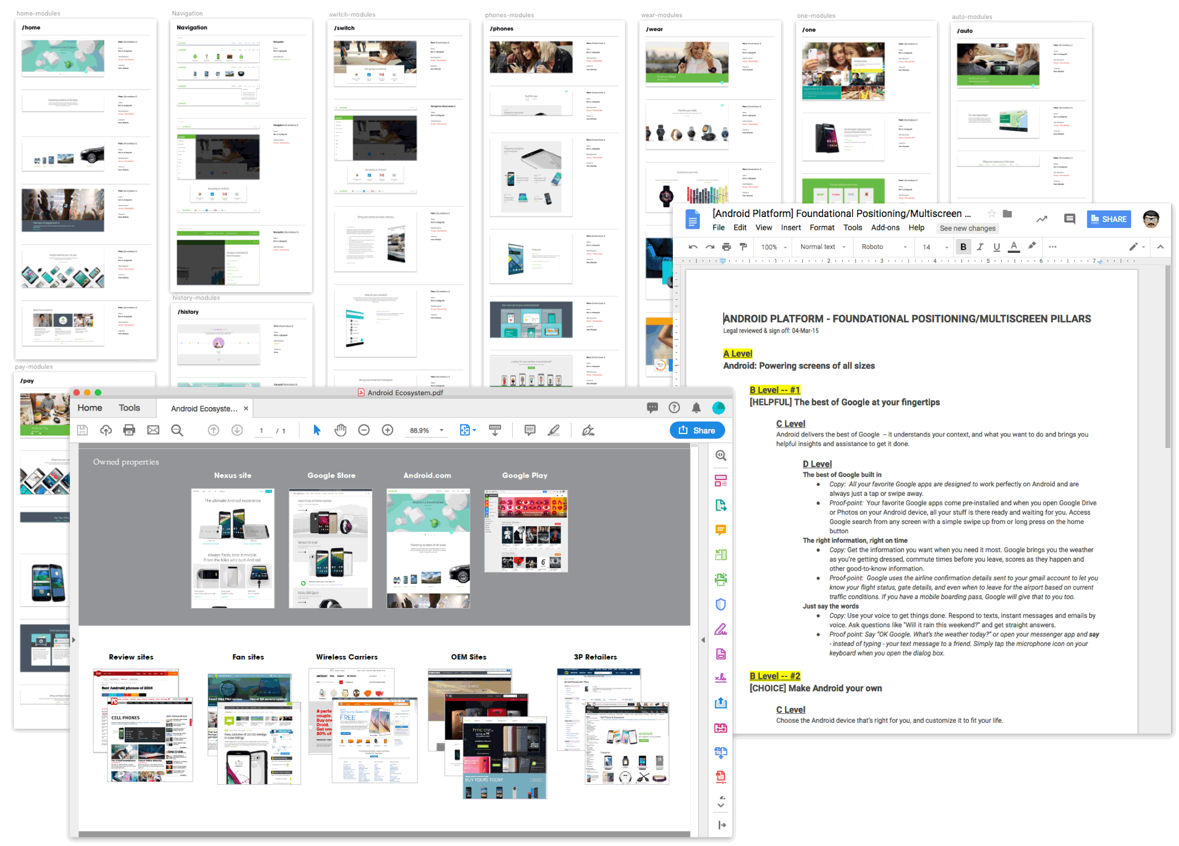
We started this project by diving into the existing Android ecosystem to understand where this site lived in the grand scheme of things. We conducted extensive site audits, digging through the existing styleguide, and modules. Meetings with stakeholders about the new brand and positioning pillars helped shape our approach towards a site that focused explaining what Android is, and what placing an emphasis on the variety of Android devices.
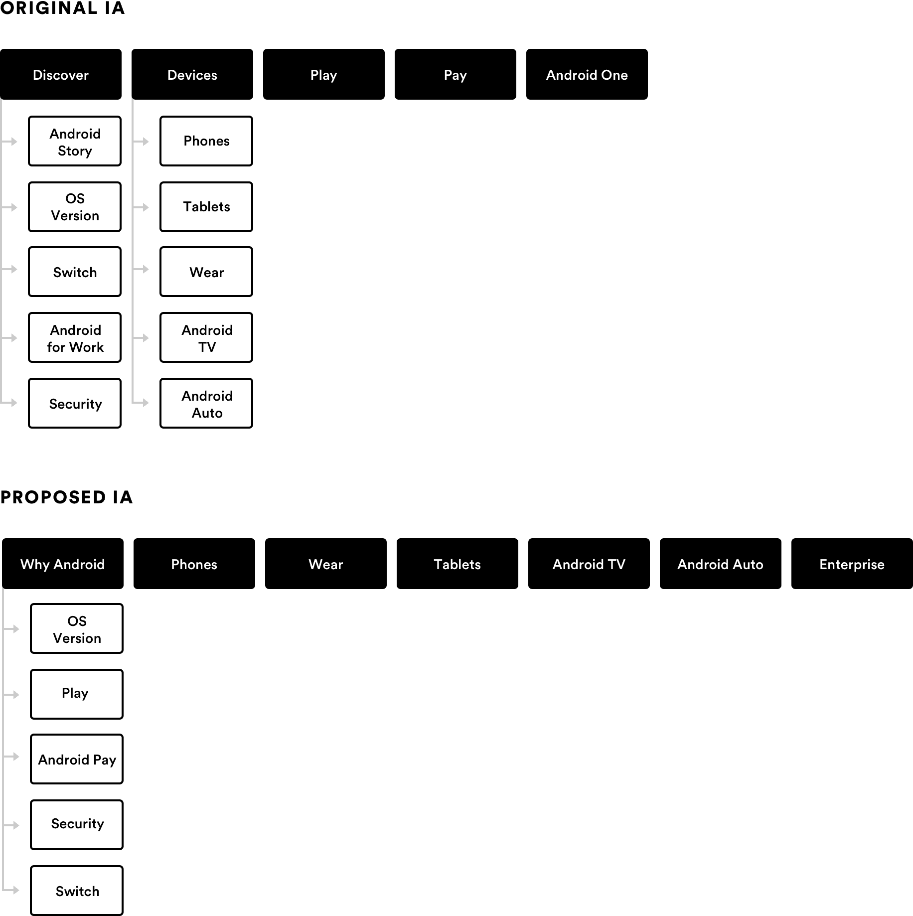
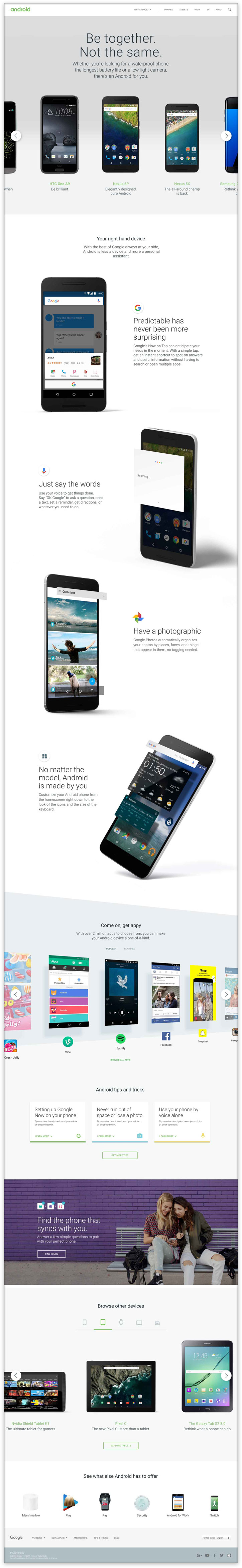
Research showed that users were familiar with the Android brand, but not with all the devices it powered. In order to communicate that message we reorganized the IA to put the devices front and center in the navigation and make a clear case for visitors why they should consider Android under the "Why Android" section.
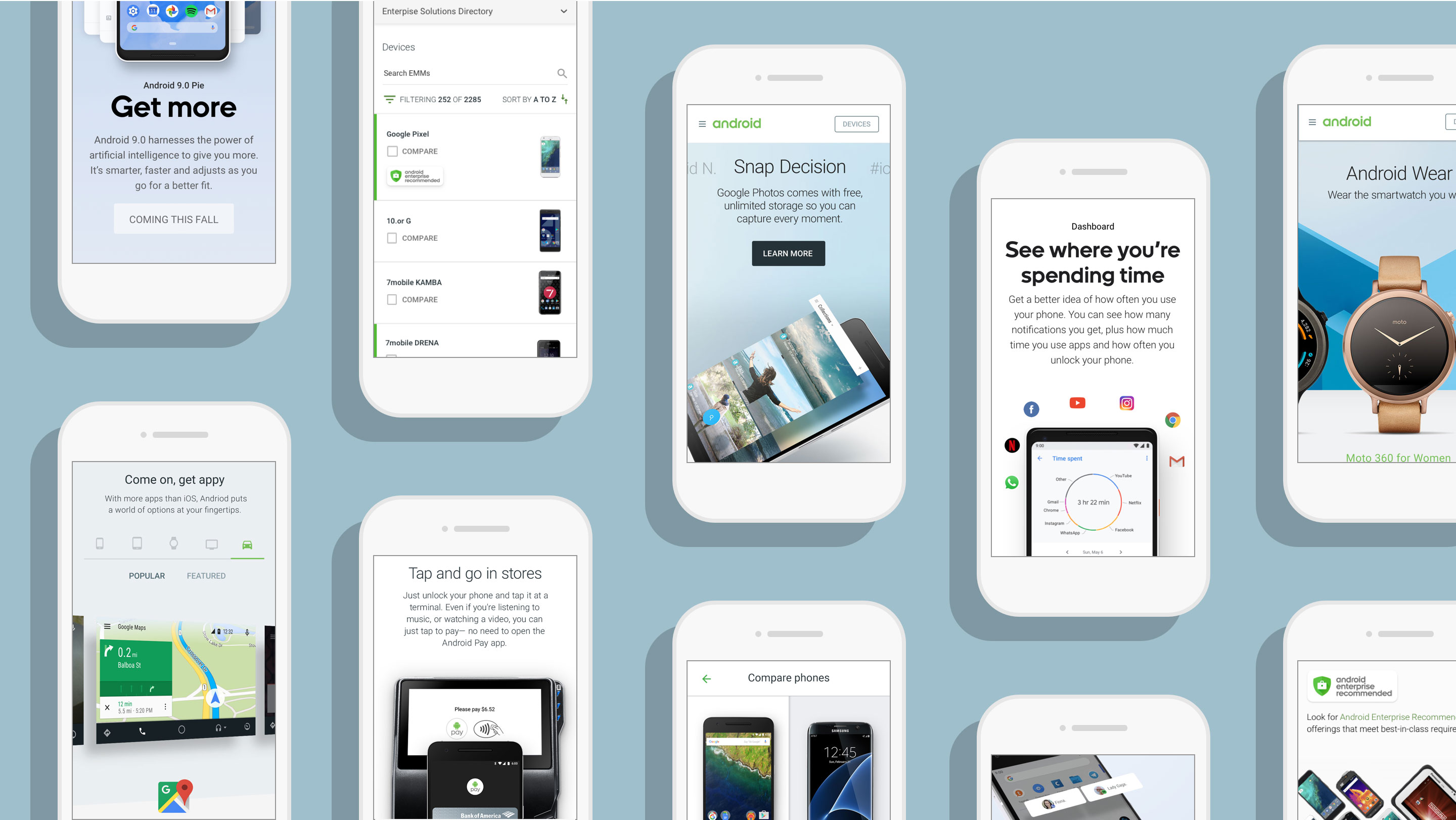
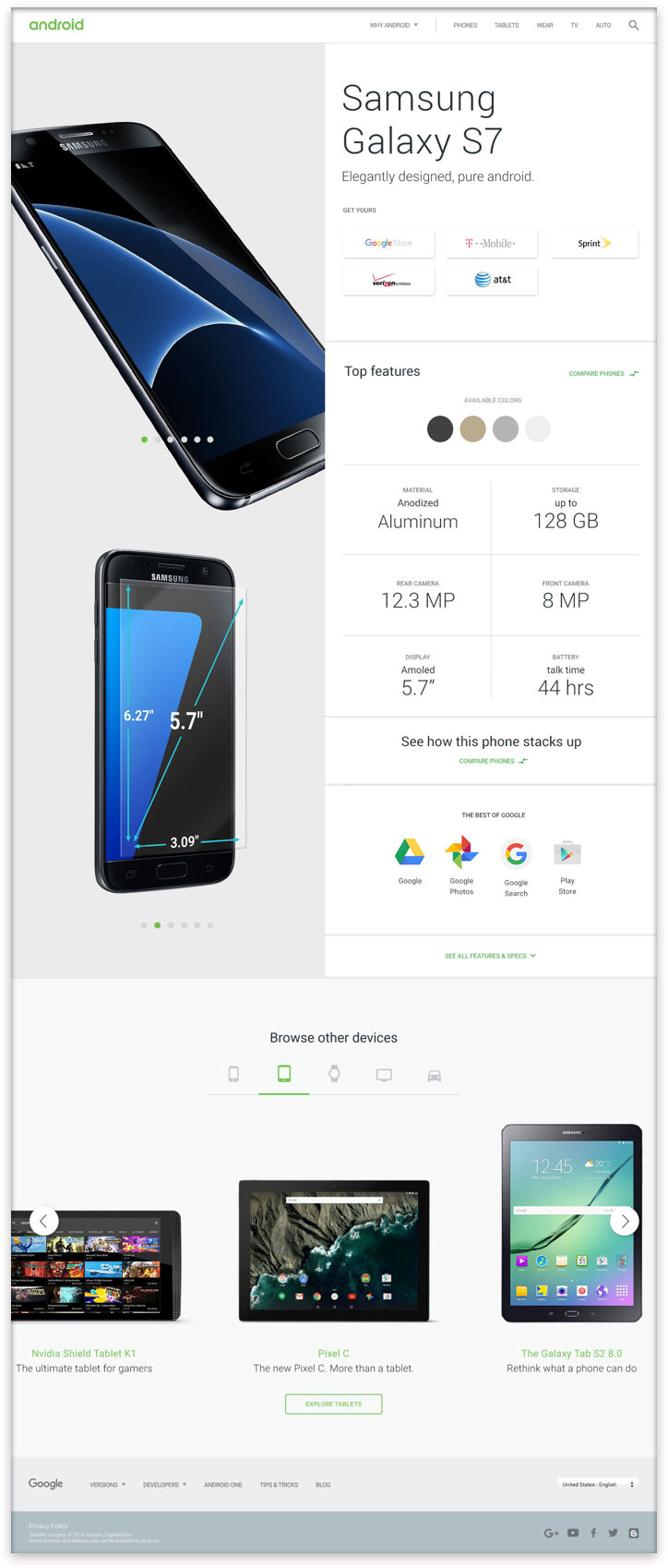
Our early explorations centered on showcasing all the different types of devices that are powered by Android. The main pages we were tasked with designing were the homepage, phones page, and the product detail page. We explored a number of ways of showcasing product announcements, diving into each device category, showcasing the latest devices, comparing devices, and seeing product details.
We let the Android operating system shine across the site by showing it power screens of all sizes. The simple and straightforward experience made it easy for new users to understand what Android is and how they can get their hands on an Android device.
Intro to Android highlighting key product announcements and demonstrating the breadth of the Android ecosystem.
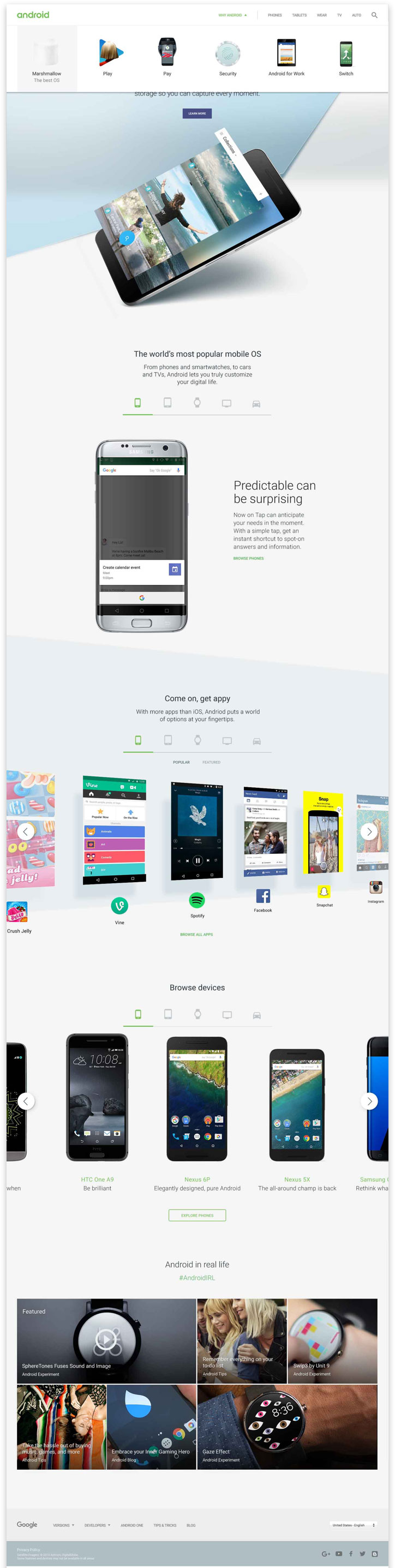
A deeper dive into the latest devices, unique features, popular apps, and helpful tips to get the most out of your device.
A standardized product page that highlights key device features, specifications, and gives users an easy path to purchase.
The Android Pay website should educate users about the product–how and where to use it, and ultimately drive users to download. Research showed that users were reluctant to use their phone to pay because it seemed complicated and foreign. The Android Pay page showed how easy it was to use Android Pay in millions of stores worldwide, while incorporating product changes, highlighting partners, and showcasing its benefits. Our design needed to illustrate just how easy it is to pay using Android Pay in-stores as well as in-apps. We needed to showcase partners and highlight the key benefits of the product.
An initial round of research made it clear that we needed to clearly show users both how to use Android Pay but also how easy it was to use. I was tasked with early strategic work, the development of wireframes and motion studies.
The Solutions Directory creates the foundation of a unique customer service experience Android Enterprise wants to provide - matching IT professionals with mobile partners and devices they need for their organizations. This site makes it easier for IT professionals to make decisions about which devices, EMMs, and carriers they want for their companies. The challenge on this project was how to create a standard system that flexed across lengthy list of Android compatible services and products - for example, there are over 5,000 unique Android device profile pages.
This site underwent a number of changes before landing on my lap. It had undergone a redesign that was run without a UX resource which resulted in the stripping of 50-70% of code before being released publicly. We were tasked with UX, Research, Design, frontend and backend giving us full control over version 2.0. I lead UX on the redesign with the initial experience strategy, wireframe development, and user testing.
Every summer Google releases their new Android Operating System and for the last three years, Huge has worked in partnership with creative and comms at Google around this moment. We were tasked with creating the landing page for the new Android P 9.0 operating system. The launch of the new OS always coincides with Google I/O, the annual developer conference. We typically find out the name of the OS a few weeks before I/O and have to make quick adjustments accordingly. This year we had the opportunity to also work on the Android Pie statue that was unveiled in Mountain View.
I lead the UX on the project working closely with a copywriter, visual designer, and motion designer. Together we took Google's strategic pillars and translated them into an experience that highlighted each feature in detail. I built wireframes, prototypes, and oversaw the motion work.


