User Experience Lead – My role was to define the initial strategy laying the groundwork for the detailed design work. As the UX Lead on the project I helped with research, conducted stakeholder interviews and workshops, built wireframes, and high fidelity prototypes.
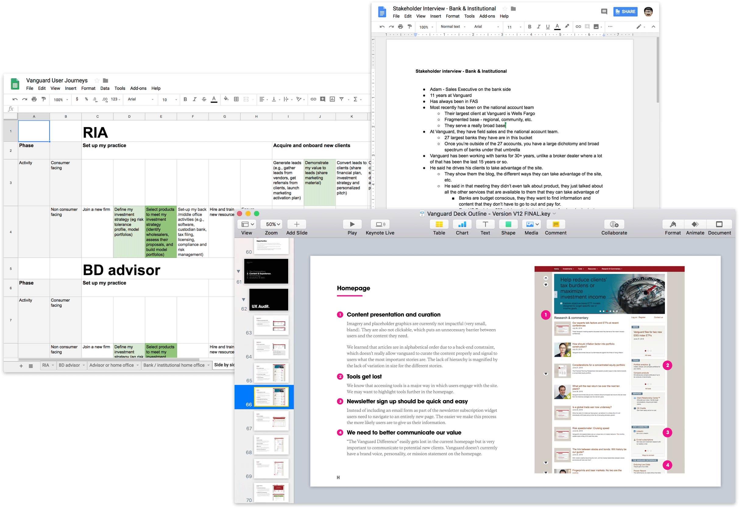
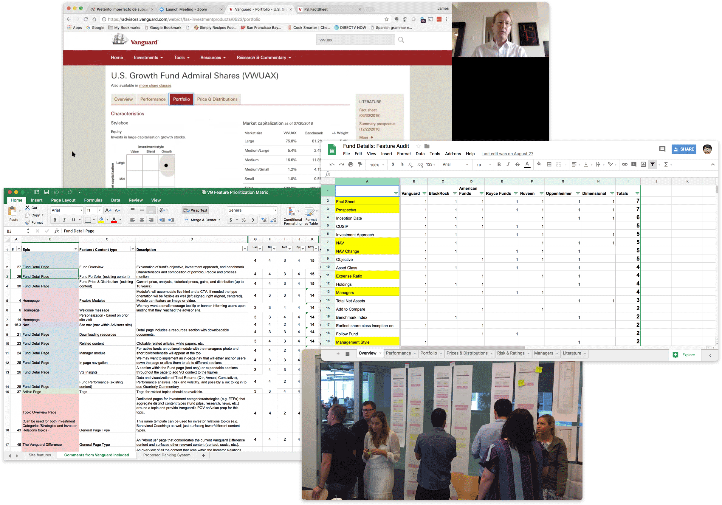
We began the discovery process by meeting with 50+ key stakeholders including financial advisors, and FAS staff. We read through 200+ pages of materials and immersed ourselves in all things Vanguard. An extensive UX audit of the current experience and competitive landscape helped set the stage for a deep dive into the content and experience strategies. We also mapped out the journeys of different types of Financial Advisors to get a full picture of how the site met different user needs.
What we found was a fragmented and disjointed experience. Many of the issues identified when isolated and evaluated on their own were not overly detrimental but when combined they resulted in an overall experience that failed by a thousand cuts.
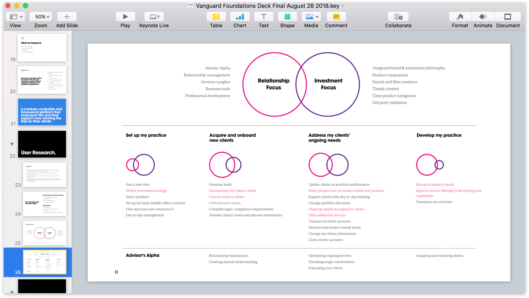
Most of the content on the current site could easily fall into two buckets; Relationship-focused content & Investment-focused content. Financial advisors value the relationships they form with their clients and are always looking for ways to improve those relationships. Financial advisors also want to be kept up-to-date on the latest investment news and easily find relevant funds.
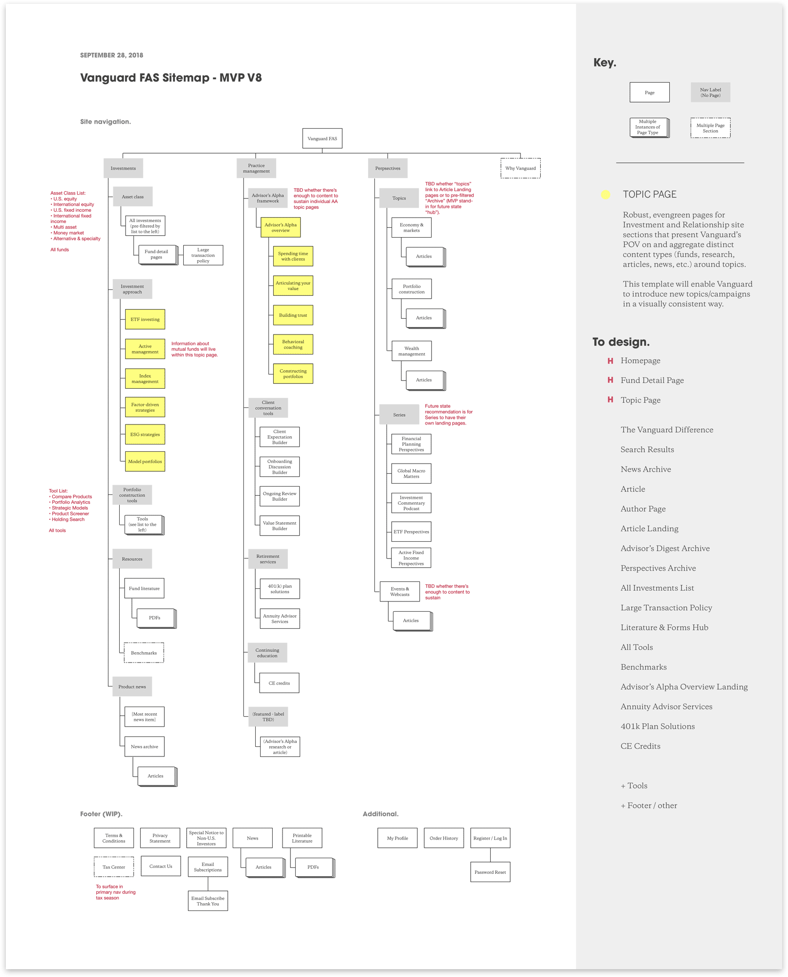
From a content strategy angle, we made sure to map the new site structure to user needs rather than internal logic. We also found that the site structure was organized by content type which obscured important content and scattered related content making it difficult to find all content about a specific topic. We created a new “topic page” template that aggregated content types and information around topics.
We defined which pages accounted for the majority of the experience and chose to focus on efforts on the pages that accounted for the majority of the experience: the homepage, fund detail page, and topic pages. A feature prioritization workshop yielded which features were feasible for an MVP launch and helped us move forward with our design explorations.
We started the design process on the fund detail page as it was the most complex page and accounted for roughly 70% of the pages on the current site. Client workshops and Exploratory research sessions helped give us the context we needed as we moved forward.
The topic page consolidated instances of duplicative content. Our new information architecture reflected the needs of the user rather than the internal siloed team structure at Vanguard. By introducing the topic page, a new page template, we consolidated instances of duplicative content. Our new information architecture reflected the needs of the user rather than the internal siloed team structure at Vanguard.
Each page template underwent rounds of reviews with our clients and reflected both business and user needs along with the constraints of an MVP deliverable. These three templates accounted for ~90% of the content on the Vanguard FAS site.
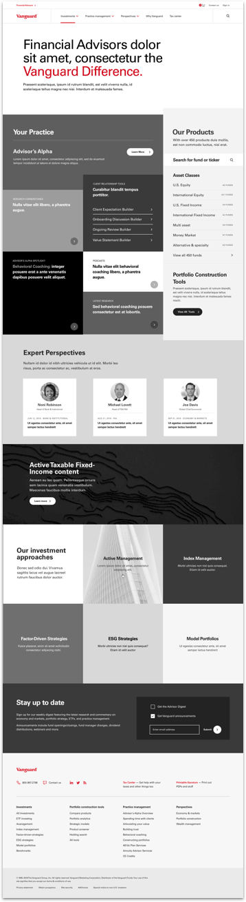
A bold entry point to announce Vanguard, describe its role to Financial Advisors, and draw users into interaction with relationship and performance content.
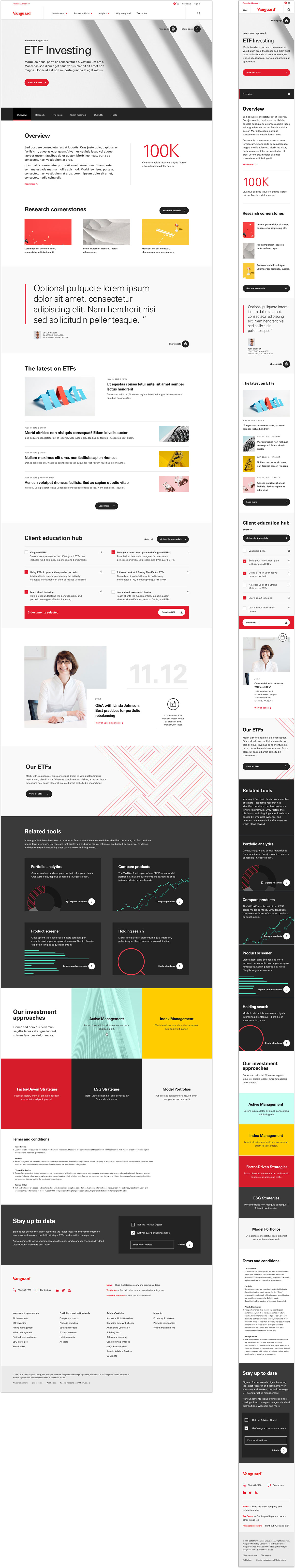
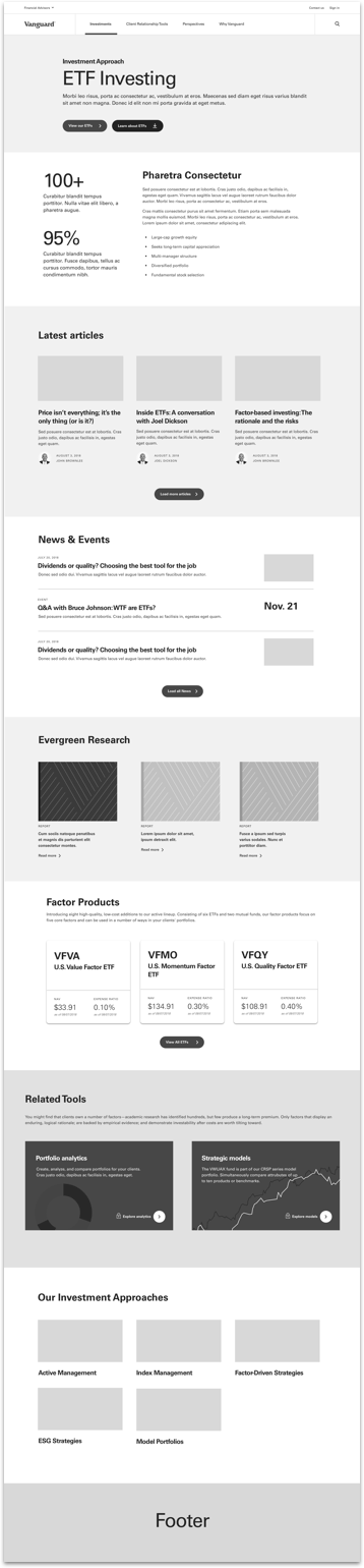
A unified place for content relating to a single topic that feels rich, insightful & on-brand while being flexible enough to encompass Vanguard topics.
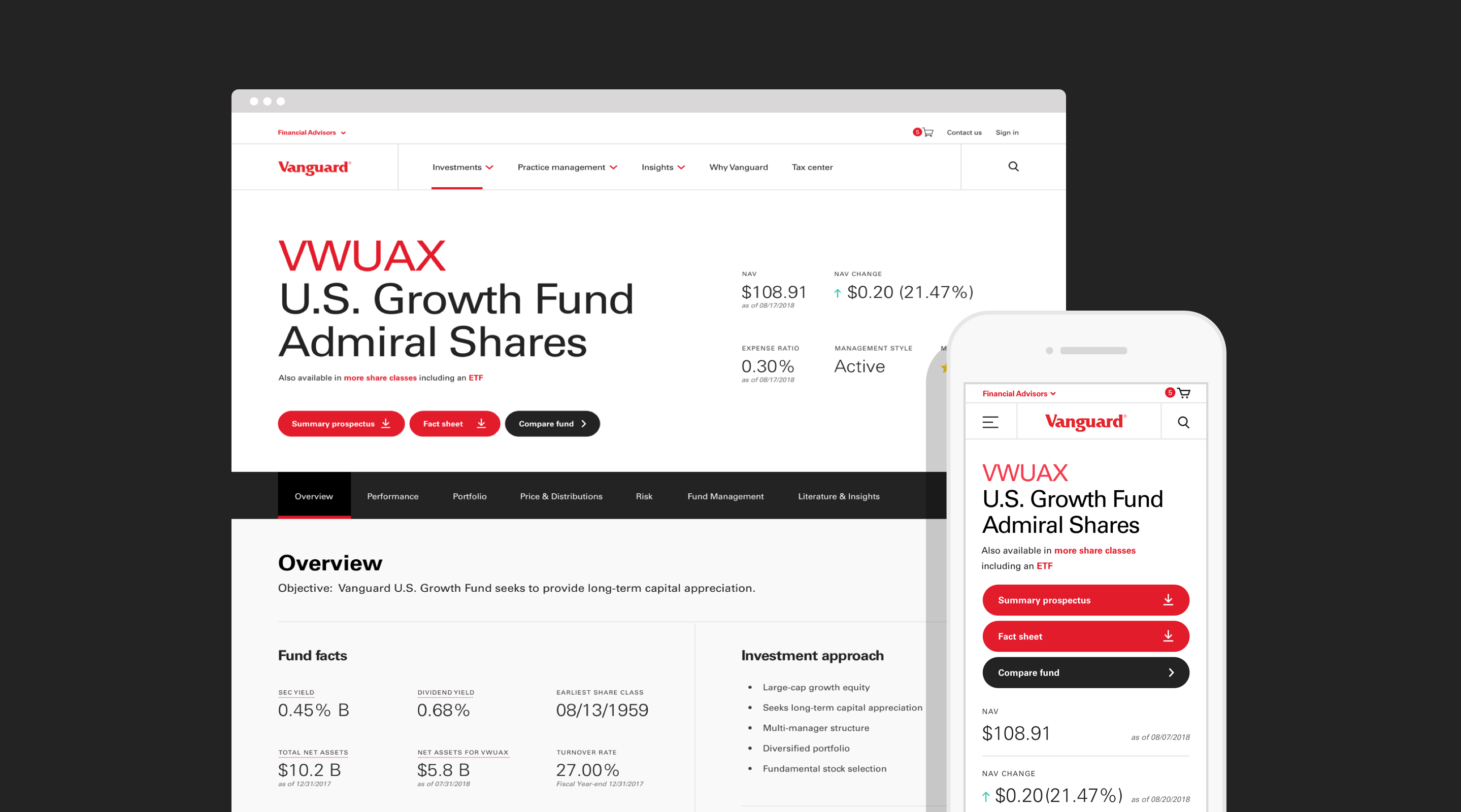
A clear, concise view of a fund that helps bring clarity to information, space to aid comprehension, and provide an improved hierarchy of information.
The design system was created in parallel with the wireframing phase. We wanted to craft a design system that could be the foundation for a new Vanguard brand, but also make the Financial Advisor Services group at Vanguard have a distinct visual style.
The homepage underwent a number of iterations until we finally landed on the following approach. Research showed that advisors desired ways to improve their relationships with clients. Vanguard had a ton of content specifically aimed at improving client relationships which was buried and difficult to find. We chose to bring that content to the forefront, enabling advisors to easily dive into that content. Several rounds of testing helped us shape the homepage experience into something that provided access to valuable content.
The homepage was divided into two halves: Your Practice and Our Products. The Your Practice section equipped advisors with the latest research, tools, and expert opinions to improve their client relationships. The Our Products section gave advisors an easy way to dive into the extensive list of products, discover new tools, and catch up on expert opinions and research.
The Fund Detail page was the most complex of the pages we designed. It accounts for the vast majority of traffic to the site, and is typically the entry point for most users arriving via search. Several rounds of stakeholder workshops, competitive analysis, and user research sessions provided the necessary insight to redesign this experience.
The overall layout of the page was informed by user research sessions which helped us improve the information architecture. A sticky navigation bar made it easy for users to find what they needed. We gave more visual weight to tools and slotted them in when contextually relevant. Advisors are strapped for time and typically have their own proprietary tools so we made it much easier to download a CSV of each section.
The topic page was an entirely new template that we created to aggregate content around a similar subject. In the original experience, content around the same subject was strewn across a number of pages and it was difficult for users to find what they needed.
The addition of the topic page helped flatten the overall information architecture and reduced the number of superfluous pages across the site. This template housed a general overview, related articles, events, research, tools, and literature.