Honest Dollar is a digital retirement savings platform powered by Goldman Sachs expertise and offers Traditional, Roth, and SEP IRAs. The business goals of this project were to increase the number of users, reduce the amount of drop-off and attract a mass-affluent audience.
I was a UX Lead working closely with a team of visual designers, and copywriters. I was involved with strategy, research, detailed wireframes, prototypes, and provided oversight for visual design.
Before I started on the project, the original goal was a total redesign of the Honest Dollar product but plans changed. A mid-2018 launch was reduced down to an early 2018 which forced the prior design team to make a lot of educated guesses about how the onboarding flow should function. In order to validate a lot of those assumptions, usability testing was conducted (which happened to by my first week on the project.)
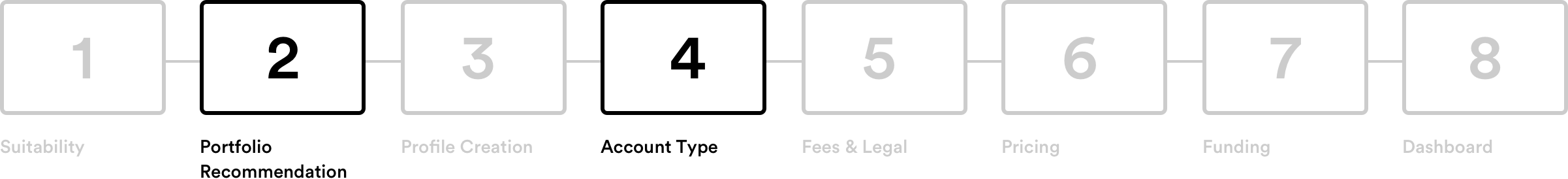
The first round of testing was mostly successful but two big portions of the flow needed further investigation. Portfolio recommendation, and Account Type selection were two parts of the flow that we dedicated entire sprints towards rethinking.
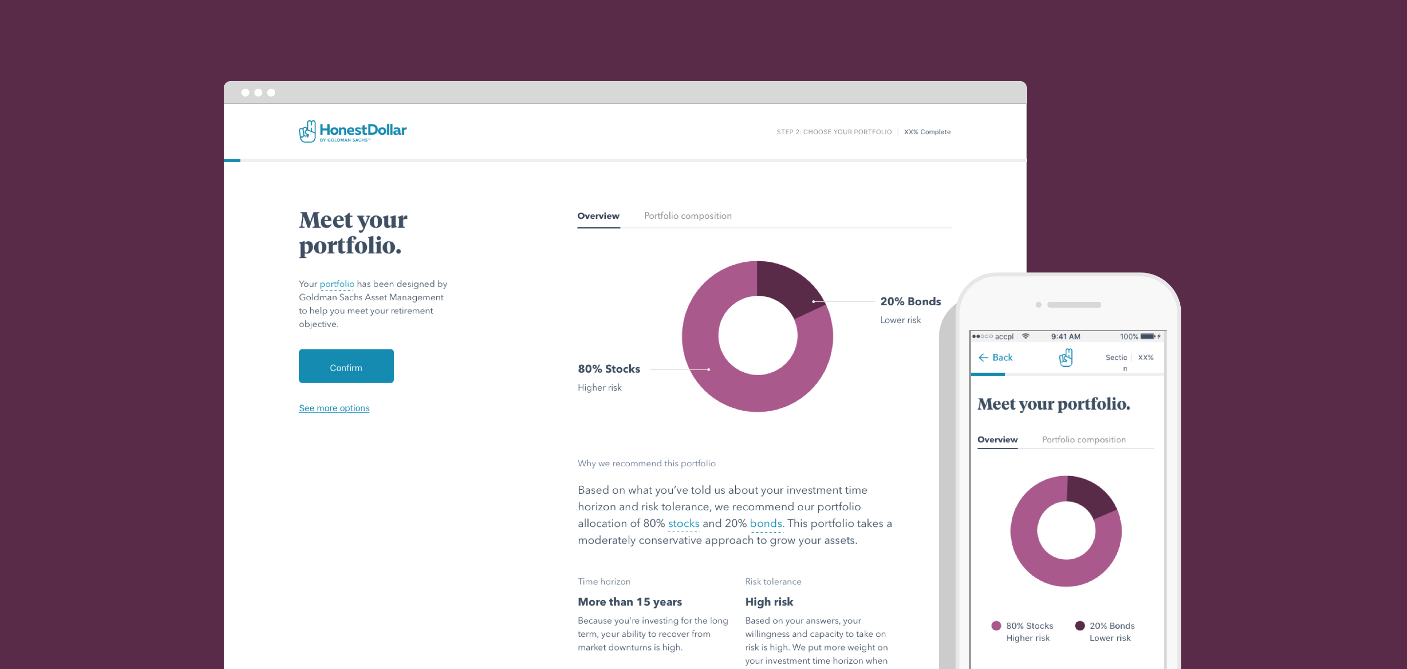
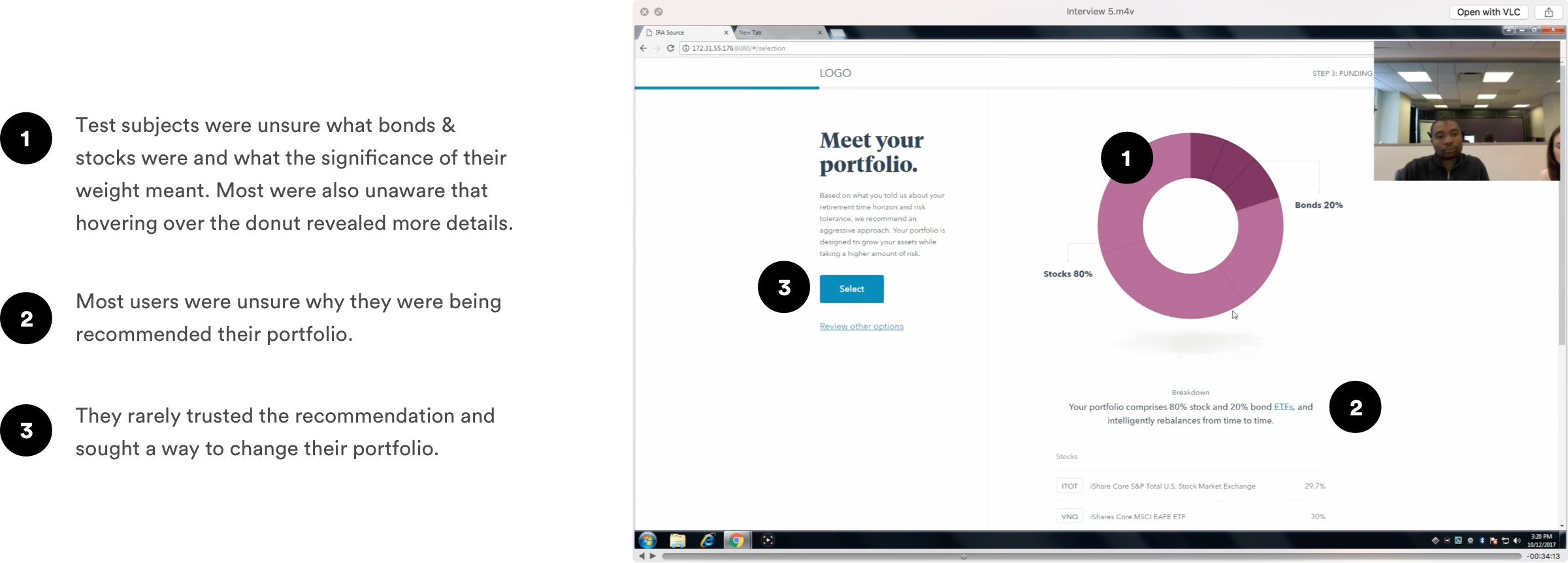
The problem with the current portfolio recommendation page was that it was not transparent enough and the copy was too advanced for most users. The prior design had assumed users knew more about finance and terminology that was expected. Users also struggled to understand why they were recommended one portfolio over another.
Our explorations were focused on educating users, making them more comfortable with their recommended portfolio, and highlighting the key information that informed their recommended portfolios.
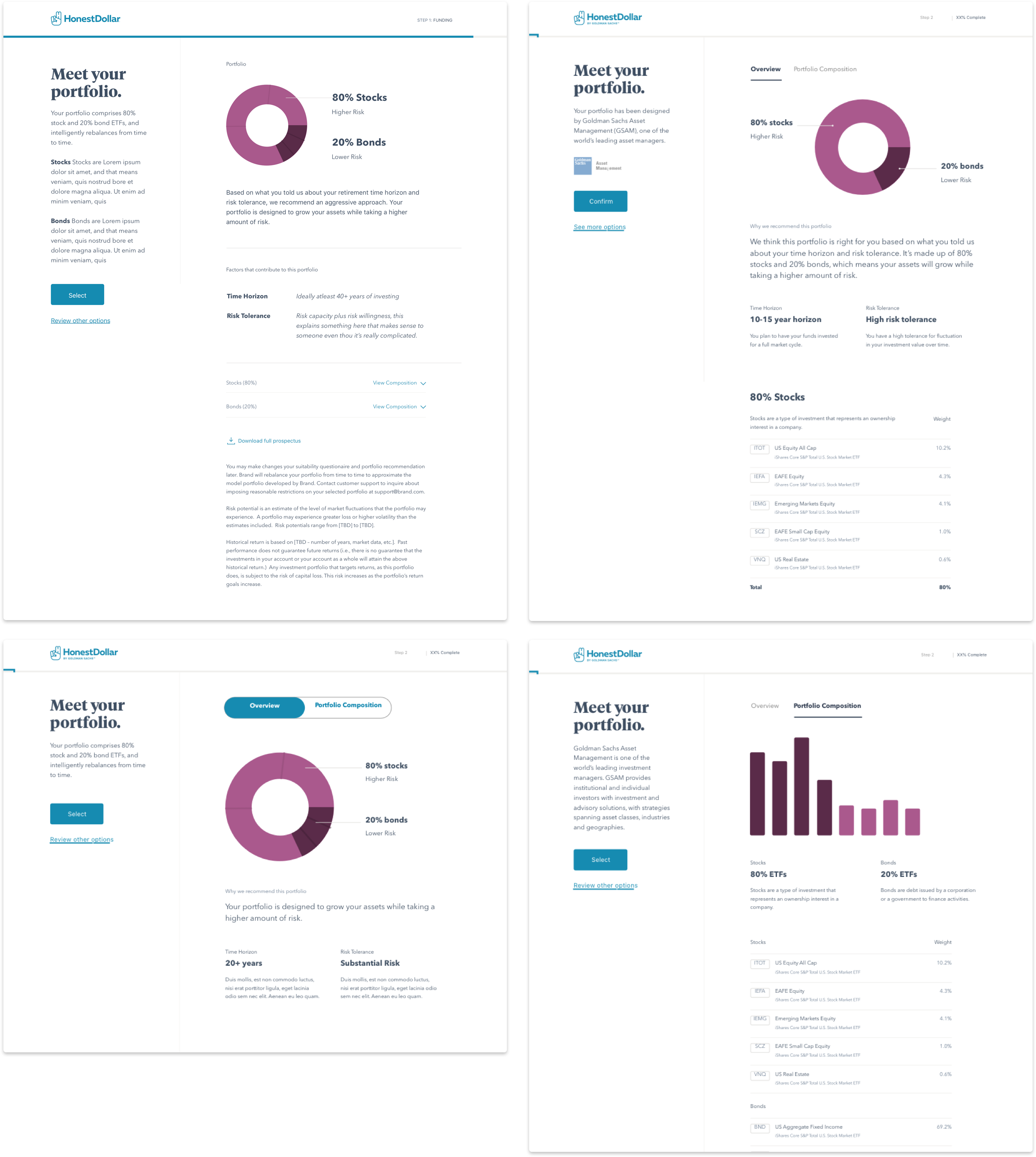
The final Portfolio Recommendation design shown in the prototype below simplified a lot of the language while being very direct and clear. When possible, we clearly showed why this portfolio was recommended and which of your prior answers in the onboarding flow led to this result.
When it came to the Account Type section users had a hard time distinguishing the difference between the account type options. There were also a few general usability issues that made it difficult to easily discern the difference between each option.
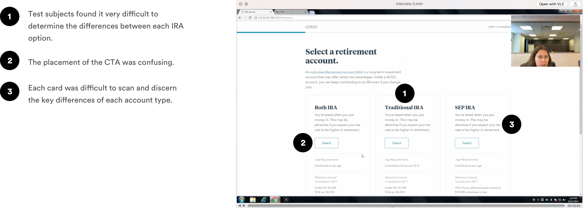
We explored various layouts but leaned towards the three card treatment for compliance reasons. We explored ways to simplify the data per card and see how the overarching descriptions could showcase the biggest differences across each option.
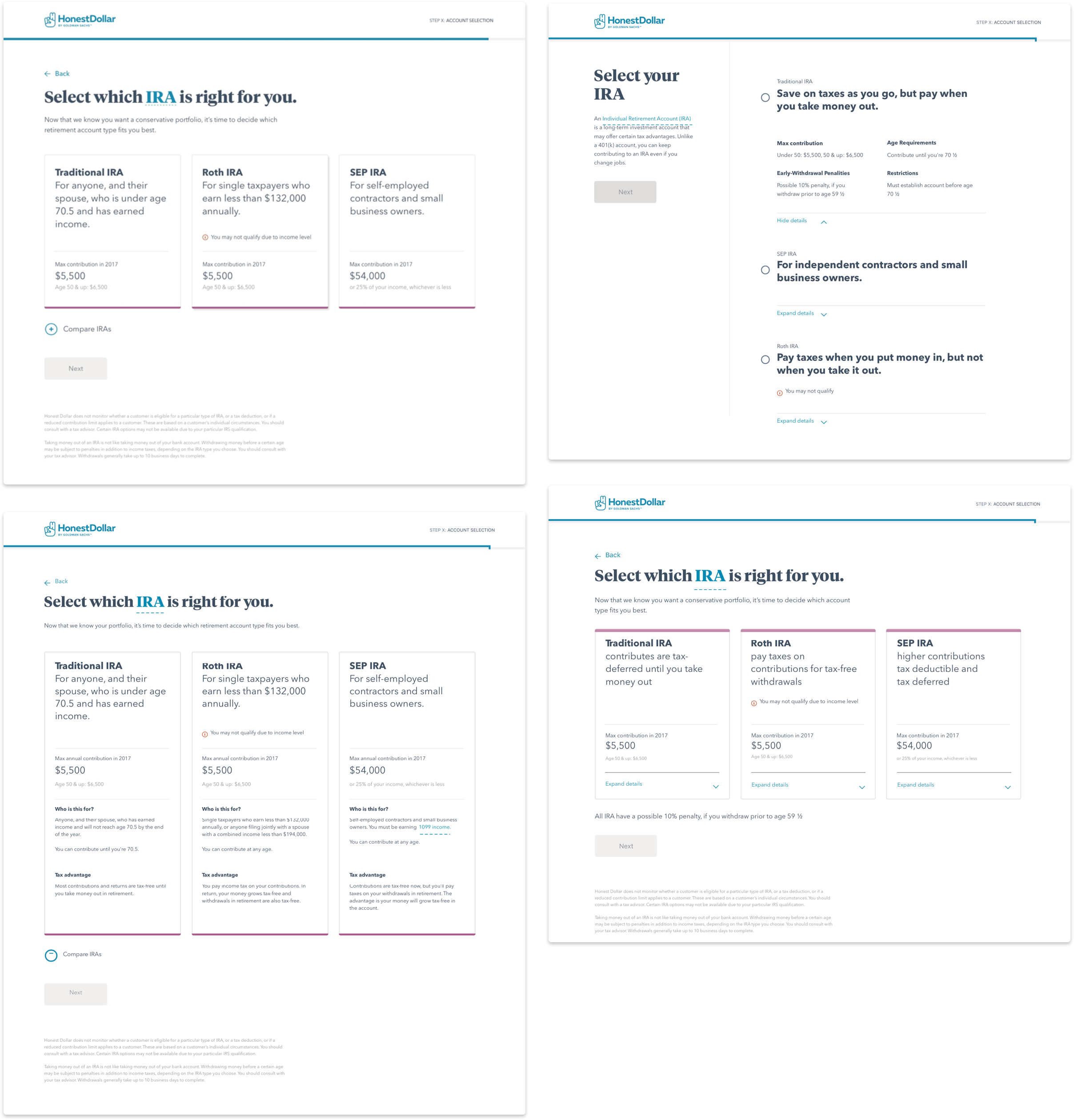
Our final Account Type design led with the key differentiating information. Spacing, and type hierarchy made it easier to scan the page. We also simplified the overall language to be much more direct and clear. If a user did not qualify for a certain account type we also featured that information prominently.
We ran these updated designs through a second round of user testing and found that while we made huge strides in overall usability and comprehension there were still areas where we needed to spend more time educating and simplifying for the financially unsavvy. Overall we were successful but took these insights into account for future iterations of the onboarding flow. After the launch of the MVP we saw a 250% increase in users within the first week and saw that 15% of those visitors were adding funds to their new accounts.


