We created a unique and noteworthy way of consuming news with TODAY’s twist. The new and improved app needed to grow and reward loyalty and acquire, retain, and delight users. We were able to go from concept to customer within 10 weeks and delivered an app that TODAY Show fans love.
I worked with the Product Design Lead and Art Director on initial concepting, wireframes, and high fidelity prototypes. I ran user testing sessions and updated designs based on feedback.
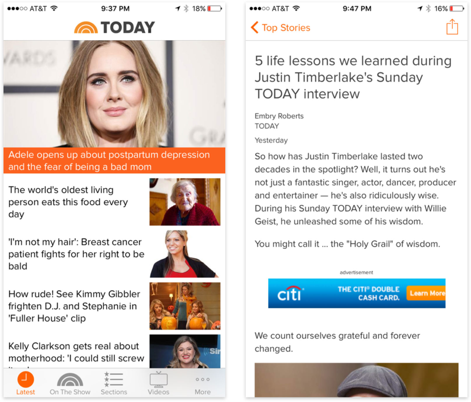
The old TODAY Show app experience felt dated and generic. The personality of the show was not present in the older experience which caused a rift between the TV and digital experiences.
The lack of labels and dates made it difficult to know which content was new or what category it fell into. Content was difficult to find and the existing structure did not lend itself to be navigable.
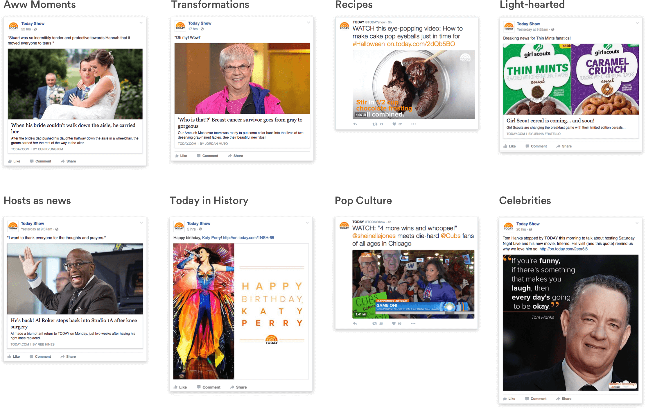
After conducting a content audit we found that the app offered mostly soft news, pop-culture, and entertainment news.
Our editorial team provided guidelines for the appropriate tone and voice of the Today show app. We wanted the app to feel like an extension of the show but feel more editorialized, useful, and funner than the Today show website.
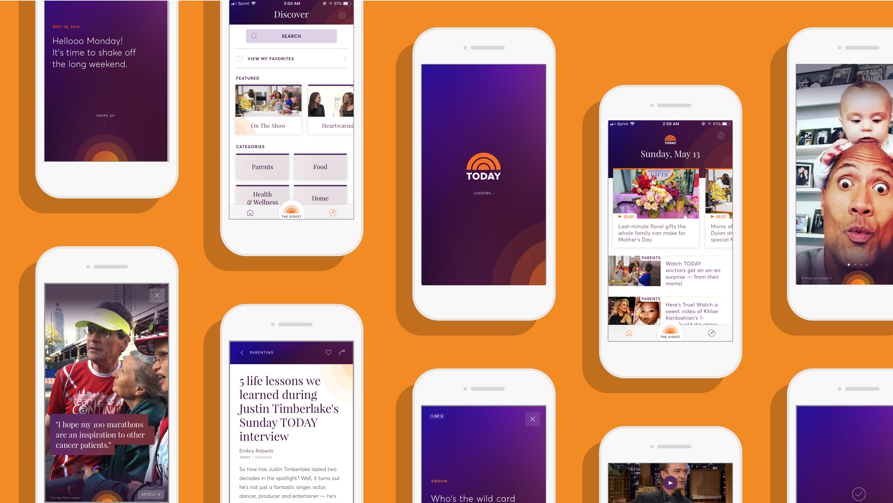
The digest was a new way of presenting timely, fun, and light content touching on the big stories of the day. The digest sat on top of the existing core app and would be the new entry-point into the updated TODAY App experience.
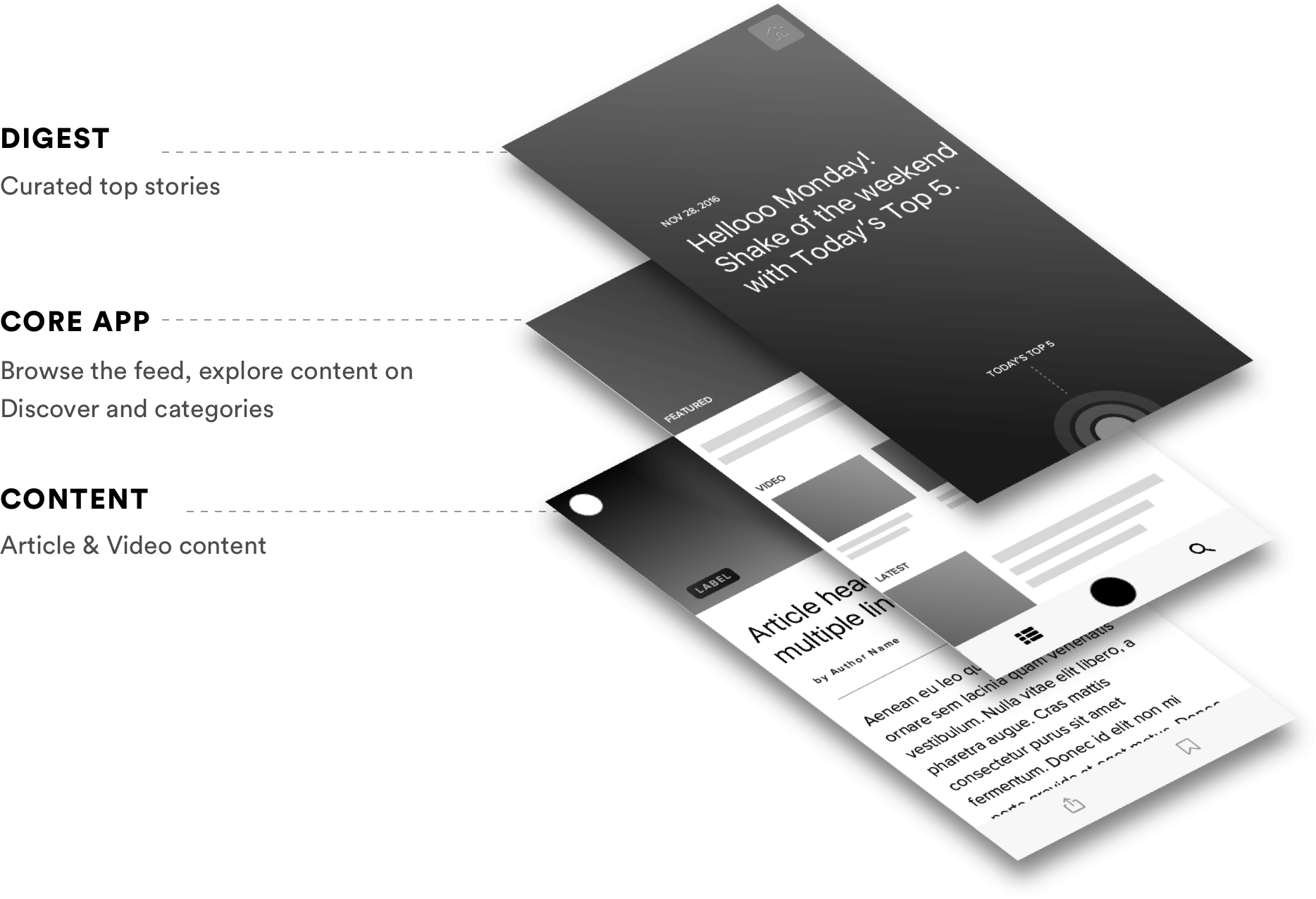
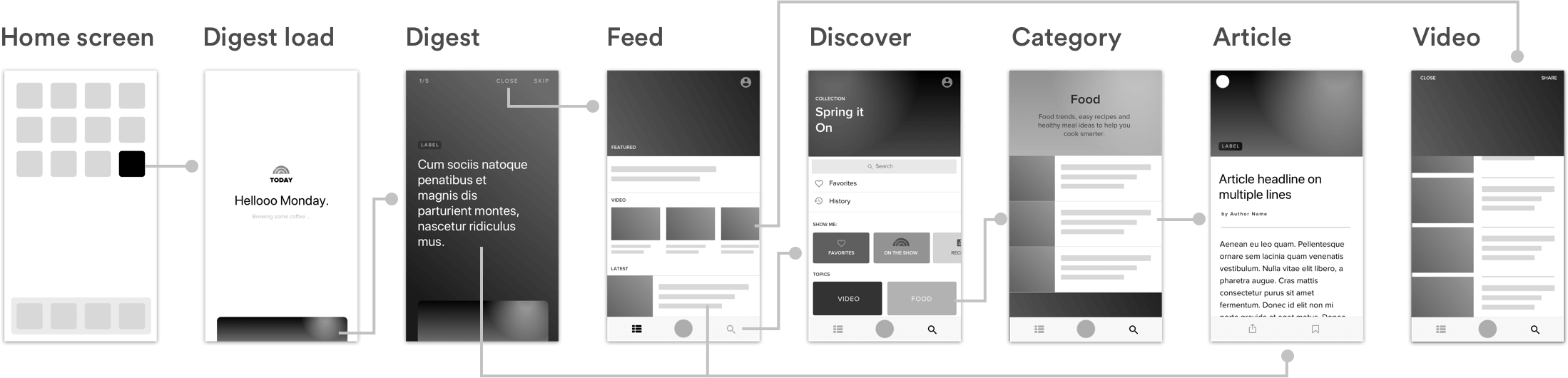
The navigation was simplified down to three main sections: The digest, the latest feed of articles and videos, and the discover section where users could search and browse by category. Video content was now easily accessible from all sections rather than being siloed in a video tab.
The big UX challenge we faced was what form the digest would take. We explored a variety of different patterns and eventually landed on a vertical card-based format. We wanted an engaging way to unfold a story told through the day's top moments.
We flattened the overall information architecture providing users three main ways to consume content. The Digest, the feed, and Discover section. The feed was a chronological list of content with a focus on video, as we knew from research that users expected to see video content from the show.
The discover section served as a way to navigate to evergreen content but also feature seasonal content as well. By moving search, and favorites into the discover section we simplified the navigation and improved the findability of content.
A new feature we created called "The Digest" provided a daily roundup of the day's top moments.
We elevated video content throughout the app. The feed served up the latest video and article content keeping users up-to-date.
We combined Search, Favorites, and Categories (Evergreen and Trending) into the Discover tab to streamline the overall navigation.
We introduced new colors and typefaces which were an evolution of the brand. With a design system in place, we made sure that future work on the Today Show brand would remain consistent across all channels.
We tested a number of different progress indicators to make sure users knew how to move through the Digest.
We explored a variety of ways to indicate content type and imposed strict word counts to keep consistency.
We visually explored a number of ways to distinguish evergreen categories from trending categories.


